This photo of this set in the new Stampin Up catalog, doesn’t do it much justice. Its really a sweet and lovely set. When I purchased this set, I wasn’t very sure about it (because of the photo in the catalog). It really came to life, once I put ink to it.
I don’t normally use this color combination. I’m not really a fan of green/orange together, but I stepped out of my box and just went with it
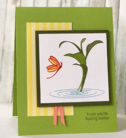
I used one of my new Favorite Colors – Granny Apple Green, Poppy Parade, Grapefruit Grove, Pineapple Punch and Mossy Meadow. I know that these color sound kinda crazy together, but it is all over beach decor these days. (I was recently at the beach with my family) and yes, I used the new Balmy Blue for the water.
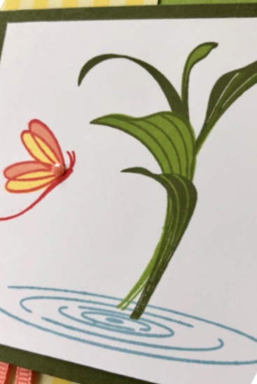
The designer paper is from the new In Color paper pack and I also used whisper white, mossy meadow and granny apple green cardstocks. Can you see the grapefruit grove faceted dot on the dragonfly? I love it.
The sentiment is from the new Itty Bitty Greetings set. This set took the place of the retired Teeny Tiny Wishes stamp set. I love all the great sentiments in this set.
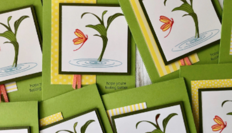
The card looks even prettier when multiplied! I think its pretty pleasing to the eye, afterall. Maybe oranges and greens really do go together better than I thought!
Oh, one more thing about this lovely stamp set that is pretty cool. Its a “reflection” stamp set. What that means is that if you flip the photopolymer stamp face down on your acrylic block, it then becomes a reflection of the main image on the stamp. There is an example in your catalog on page 158.
Below is a list of the products that I used. Enjoy!

Leave a Reply